
Logo vs Brand Identity: Your Logo Alone Is Not Your Brand
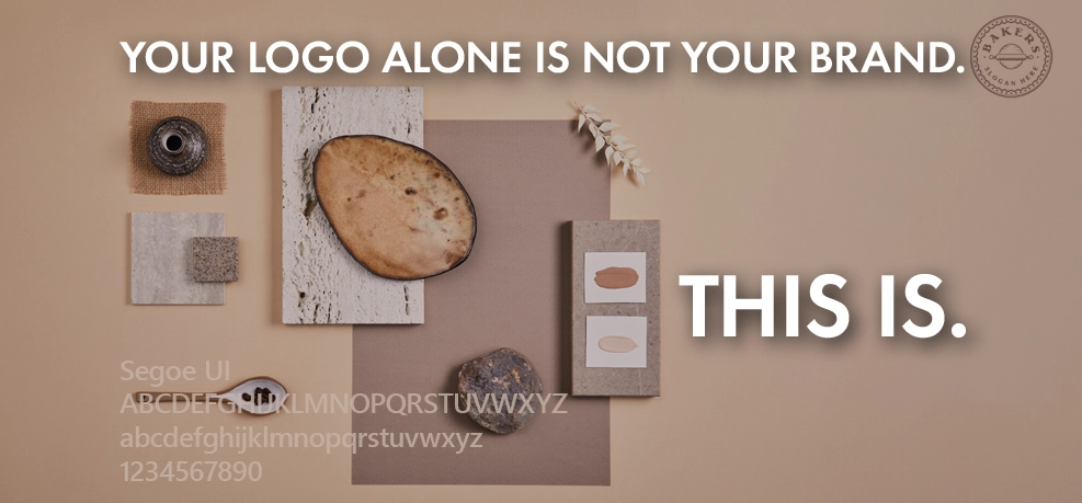
Founders spend three months on logo design. They agonise over the curve of a letter, poll the group chat, sit with two options for a fortnight, and pour a surprising amount of emotion into a mark that, in the end, a customer will glance at for a fraction of a second. Then the brand launches and still feels thin, and nobody can quite say why. The logo was never the problem, and it was never going to be the solution. The logo is the most visible decision you will make, which is exactly why it gets treated as the most important one, which it is not.
What a Logo Actually Does
A logo is a marker of recognition, not a message. It does not explain what you sell, it does not carry your positioning, and it does not, on its own, persuade anyone of anything. Its job is to be the thing people learn to recognise once they already know you. Think of the marks you recognise instantly: they became meaningful because the brand behind them earned meaning, not the other way round. The logo is a hook you hang recognition on, and early on, when nobody recognises it yet, it is carrying far less weight than the founder staring at it believes.
What Brand Identity Actually Does
The brand people feel is the brand identity around the logo: the colours and how they are used, the typography, the way photography is handled, the layout and spacing, the tone of the words. A modest logo inside a disciplined, distinctive system will build a stronger brand than a beautiful logo surrounded by chaos, every time. This is the same point I keep arriving at from different directions, most directly in why a brand ends up looking like five different brands: consistency across the system is what customers register as a brand, and the logo is one small, fixed part of that system, not a substitute for it.
The Over-Design Trap
Because the logo gets so much attention, it often gets over-designed. The clever mark that needs explaining. The intricate illustration that looks wonderful on the presentation slide at full size and turns to mud the moment it is small. And for a D2C brand, small is where the logo actually lives: as a 200-pixel avatar, a favicon, a stamp on a parcel, a watermark on a marketplace thumbnail seen for half a second on a phone. A logo that only works blown up on a wall is a logo that fails everywhere your customer meets it. Test it tiny, test it in one colour, test it in the wild before you fall in love with it at full size.
When to Actually Invest
The irony is that the founders who over-invest in the logo often do it too early. Week one, when you are still changing your mind about what the brand even is, is the worst time to commission a definitive mark; you will likely revise the brand’s whole idea of itself before the ink is dry. A rough, honest placeholder is fine while things are still moving. The time to invest properly in logo design is when the positioning has settled and you are about to put the mark on things that are expensive to redo, packaging runs, signage, stationery, a website rebuild. That is the same foundational-versus-disposable judgement I wrote about in when a D2C brand actually needs a designer: a logo becomes worth real money at the exact moment it stops being easy to change.
A Better Brief
When it is time, brief the logo for the job it really has to do, not for how it makes you feel in the meeting. “Make it pop” tells a designer nothing. Where will it live, and how small does it get? Does it need to work in a single colour, stamped or embossed? What sits next to it? What should someone feel in the quarter-second they register it? A logo briefed against reality comes back quietly right. A logo briefed on emotion comes back needing another three months.
The logo matters. It just matters less, and later, than the attention it attracts would suggest. Spend the saved attention on the system it lives inside, and the brand will feel like something long before the mark does.