
Big brand energy. Small brand budget.
A children's underwear brand built from nothing — character, wordmark, colour system, and packaging that could hold the shelf next to the nationals.
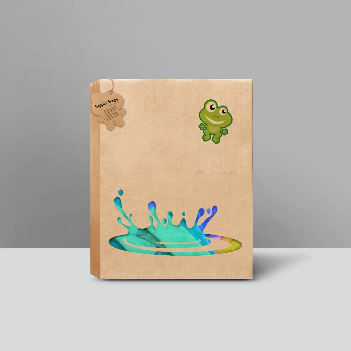
A commodity category with no room for a new name — unless the name has a face.
Children's underwear is a shelf staple driven entirely by packaging. No advertising budget. No celebrity. Just a 30-second decision at the retail fixture, with the child pointing. The brand needed a character strong enough to earn that point — and a packaging system versatile enough to run across the full SKU range without looking assembled.
One character. Infinite energy.
The hoppin' frog — a single mascot carrying the whole brand. Drawn to be immediately loveable, instantly reproducible, and scalable from a 2cm swing tag to a full box face. The name came first ("hoppin' frogs" — loose, fun, impossible to forget), then the wordmark was drawn to match its energy: rounded, informal, distinctly not corporate.
Colour was kept deliberately bold — a palette a child could name — and the packaging structure was designed as a system from the start so every new colourway felt intentional rather than incidental.
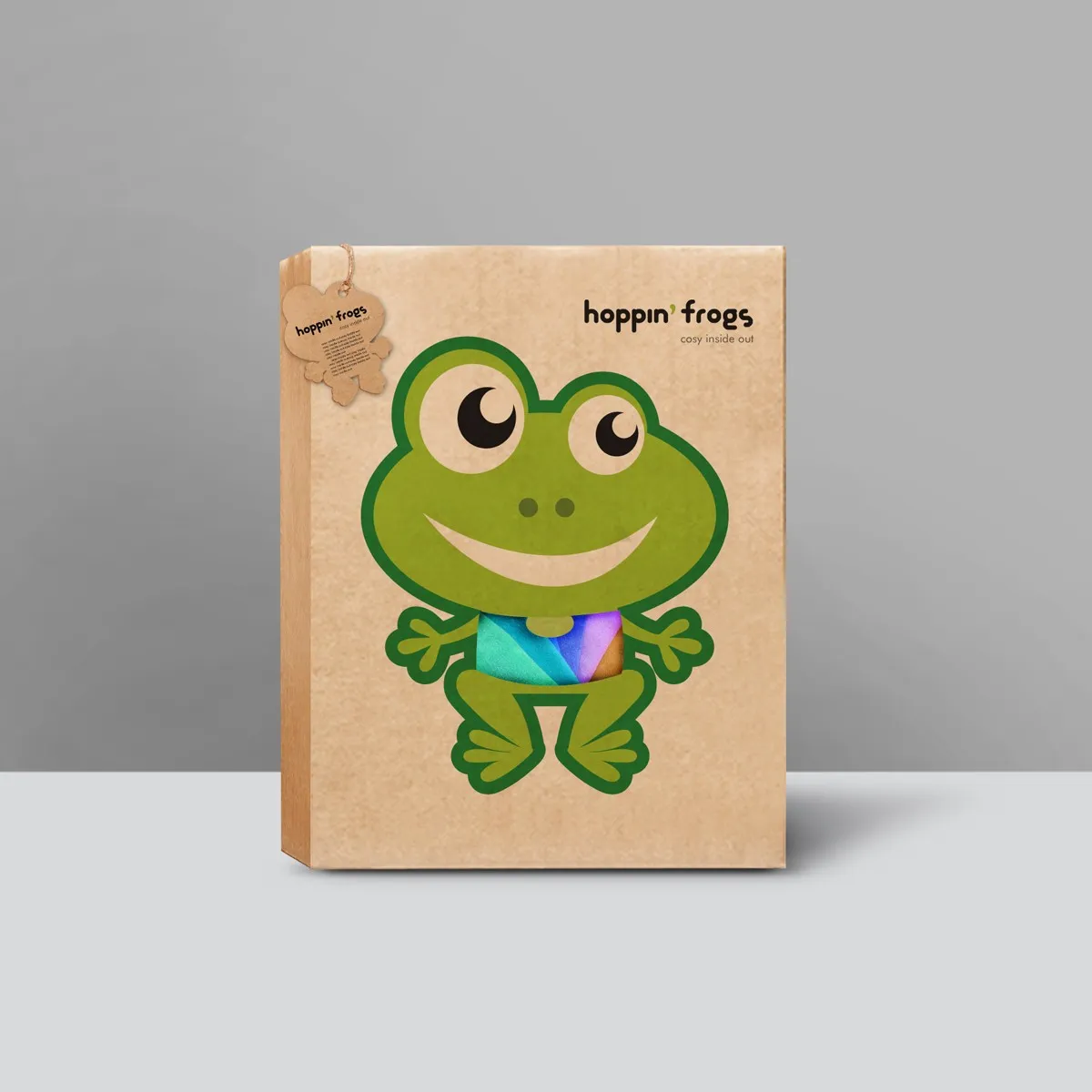
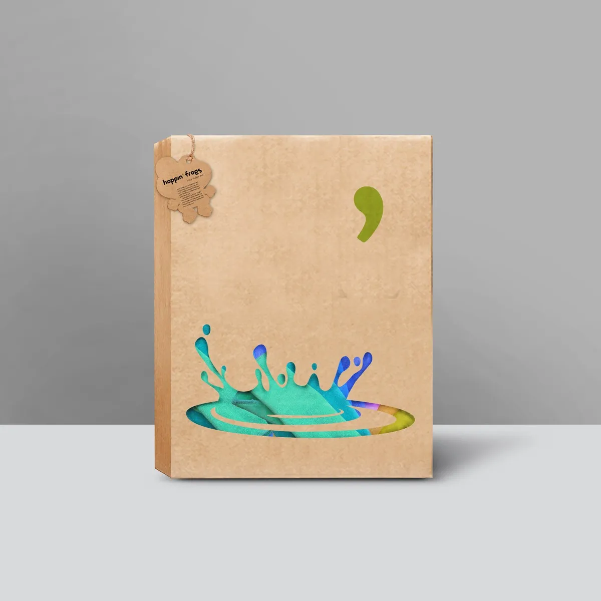
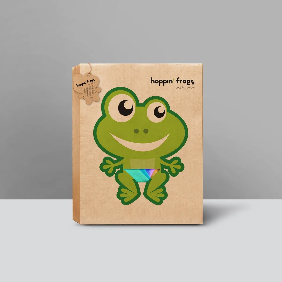
We wanted something children would recognise and ask for. The frog did that on day one.
A brand system that keeps working without a keeper.
Craft note: the mascot was drawn to work at every scale — the test was whether it still read clearly at thumbnail size on a product-listing page, not just at full-bleed box scale.